
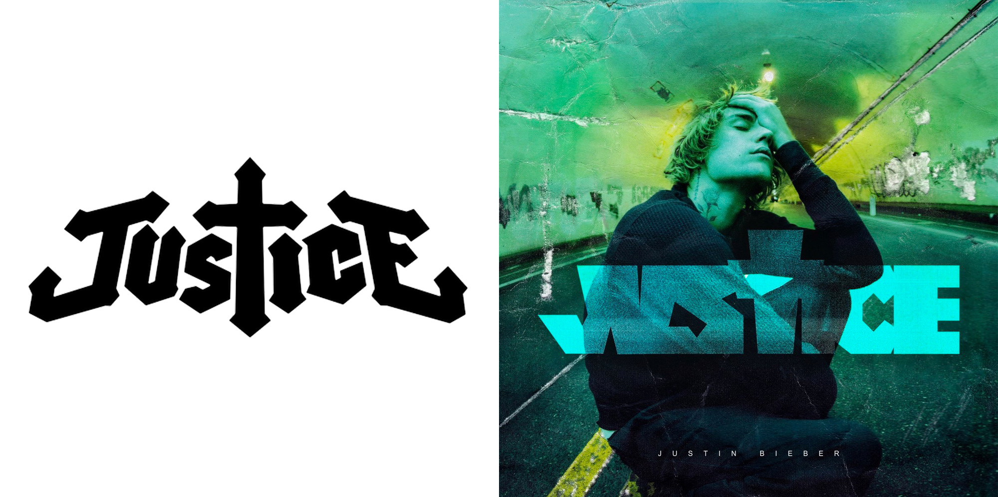
Justin Bieber has a new album coming out, Justice. The album, scheduled for release March 19, 2021, Just released its album cover artwork. The artwork features what looks like Bieber photoshopped in a tunnel, with the name of the album overlayed on him. The font is a thick block font, with the “T” in Justice made into a cross.
Bieber lays heavily into his faith, which is why he made the T into a cross, but it is a move we have seen done before. Justice, the French electronic duo, has done the same thing with their logo, in a font that is arrow tipped.
It is very well likely that Bieber’s team was inspired by and in the end ripping from Justice’s logo. Bieber’s team contacted Justice’s management about working together on the graphic last year. They emailed them in May 2020, asking to connect with their graphic designer. The call was never completed and the Bieber team went silent.
After seeing the announcement, they noticed the similarity. Justice hasn’t made any official comments, but their label, Ed Banger, made a social media post. They took to Instagram and shared Bieber’s original sketch for the Justice art, jokingly appointing him as Art Direction, while thanking their actual longtime in-house designer, So Me.
Take a look at the two images below to compare!
View this post on Instagram
Leave a Reply